01
Cash out | app design
Ualá is an Argentine fintech company that seeks to democratize access to financial services through a simple and innovative digital app. It offers accounts, cards, investments, and loans, with a focus on user experience and accessibility, operating in Argentina, Mexico, and Colombia.
Role:
Product Designer
Client:
Ualá
Industry:
Fintech
Context
As a product designer on the Payments – Cash In/Cash Out team at Ualá, I worked on an initiative to incorporate a new cash withdrawal option: participating merchants (such as supermarkets and pharmacies).
Until then, the withdrawal screen offered two alternatives:
ATMs
Participating locations (Pago Fácil and Rapipago))
Each required different steps and conditions, but they were presented within the same interface, with outdated components and a low level of clarity.
Need
The project had three main objectives:
Business: Add new cash withdrawal channels to expand geographic coverage, especially in areas without ATMs.
Users: improve understanding of the different retirement options and their requirements.
Design: Reorganize and update the selection screen, applying the current design system and aligning the experience with other similar flows.
Process
Analysis and diagnosis
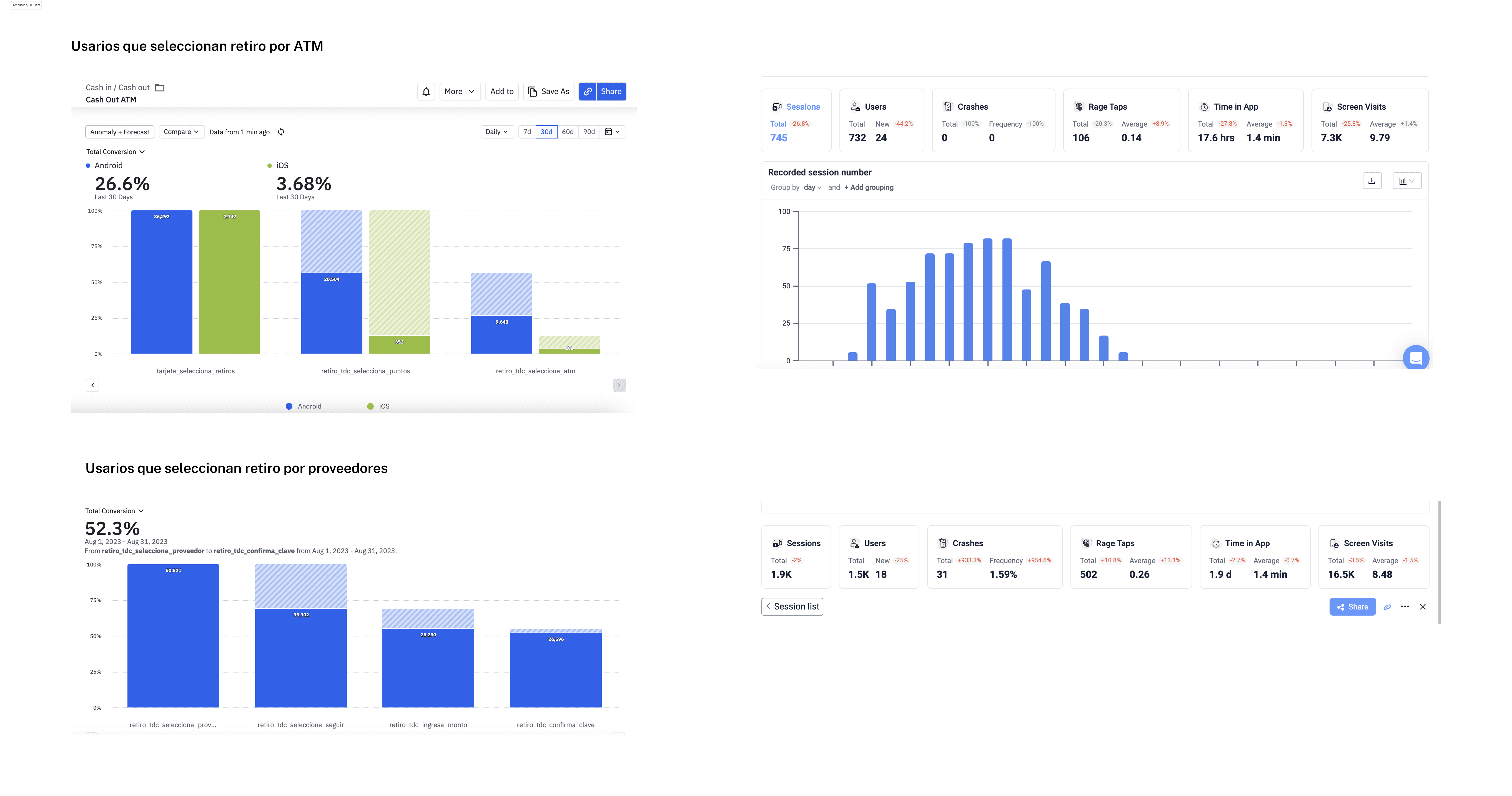
I analyzed data in Amplitude:
Only 26% of those entering the flow chose to withdraw via ATM.
At Pago Fácil and Rapipago, just over 50% completed the code generation process, indicating friction in the experience.
I used UX Cam to observe actual behaviors and detect drop-off points.
I benchmarked financial apps to understand how they structured similar flows.
I reviewed components and patterns from the current design system to define a consistent solution.
Exploration and design decisions
I redefined the flow structure to clearly separate the three options.
I decided to visually align the design with the “Load Money” flow, as they shared hierarchy within the app and a similar structural logic.
I organized the options by prioritizing them according to usage and expected conversion.
I proposed clearer, more textual navigation, improving understanding of the steps and requirements for each alternative.
I designed the display flow for participating stores, considering two scenarios:
The ideal proposal included a map integrated into the app, which would show nearby businesses based on the user's location.
Due to technical limitations and business decisions, we implemented an alternative solution:
a list of participating supermarkets and pharmacies, which, when selected, redirected to Google Maps with the branches already marked.
Result
A new withdrawal option was added at participating merchants, expanding the channels available for accessing cash.
The final interface was aligned with the updated design system, creating consistency with other key experiences within the app, such as the money loading flow.
A scalable solution was achieved, adaptable to future additions of new channels.
The design was validated internally and prioritized for implementation within the team's roadmap.